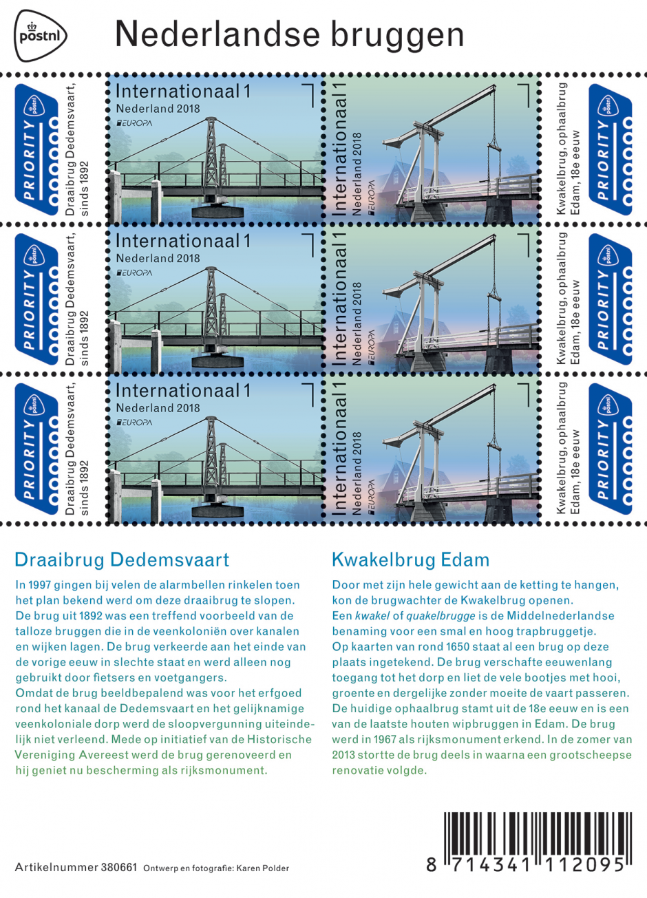
Europa 2018 – Dutch Bridges
Netherlands – The cooperating postal companies in Europe have been publishing stamps with a common theme for more than 60 years. In 2002 they introduced a competition: the EUROPA Stamp Best Design Competition. This competition is organised under the aegis of PostEurop, a partnership organisation of all European postal administrations and enterprises. Since the theme for the 2018 competition is bridges, PostNL has decided to issue a Dutch Bridges stamp sheetlet. These stamps, to be issued on 26 March 2018, will be marked with ‘1 International’, the denomination for international mail items. They will depict two characteristically Dutch bridges: an iron swing bridge in Dedemsvaart and a wooden bascule bridge in Edam. The stamp sheetlet with six postal stamps in two different designs was created by graphic designer Karen Polder from The Hague.
The swing bridge over the Dedemsvaart canal was constructed in 1892 by G.J. Meijer from the Dutch village of Musselkanaal. The counterclockwise-rotating bridge was built from wrought iron, has a wooden bridge deck and rests on stone abutments and a central pier. The central pier supports a cross beam connected to the rollers that rotate the bridge. The rollers are operated by hand using a key. On the cross beam there are lattice columns that hold the bridge girders in place using tension rods. The parapets are also made of wrought iron. The bridge is a rather wonderful and rare example of a 19th century swing bridge over the Dedemsvaart canal. This waterway between Hasselt and Overijsselse Vecht played a key role in the reclamation of the peat bogs in this region.
The Kwakelbrug in Edam is a narrow wooden bascule bridge that dates back to the eighteenth century. The bridge was already marked in a map published by Frederick de Wit after 1698, the original copperplate for which was engraved in 1650. The bridge, which spans the Boerenverdriet canal, is located at the end of Scheepmakersdijk This type of bridge is sometimes also called a drawbridge. The bridge’s uppermost beam has a heavy triangular counterweight at its tip. When this is drawn down using a chain, a beam on the other side of the bridge lifts two chains which raise the bridge deck. Beside the bridge on the Boerenverdriet canal is a small shipyard.
The six postal stamps on the Dutch Bridges sheetlet show edited photos of two characteristically Dutch bridges. The three postal stamps on the left depict the swing bridge in Dedemsvaart, the three on the right depict the Kwakelbrug in Edam. The photo of the swing bridge was taken from the water, while the photograph of the Kwakelbrug was taken from the water’s edge. The bridges are embedded in the sky and in the water, set against a transparent background of buildings and vegetation. Depicted in black in white, the bridges contrast sharply with the soft hues of the horizontal bands of colour in the background. The typography, positioned at the top edge of the Dedemsvaart stamps and on the left-hand edge of the Edam stamps, indicates the denomination ‘International 1’ for international mail items, the ‘Netherlands 2018’ caption, and the PostEurop logo. The key facts about each bridge are set out on the tabs below the Priority logo, on the left and on the right. The title of the stamp sheetlet is printed on its top edge. Detailed information about the bridges can be found on the bottom half of the stamp sheetlet. This text is printed using a colour gradient that goes from green to blue. For the typography, graphic designer Karen Polder chose the font Monotype Grotesque (Frank Hinman Pierpont, 1926).
Three years ago PostNL issued a stamp sheetlet called Bridges of the Netherlands. It depicted ten post-World War II bridges in the Netherlands, including the Zeelandbrug over the Oosterschelde, the Hanzeboog in Zwolle and the Nesciobrug in Amsterdam. The focus of that issue was on the bridges’ remarkable architecture. The new issue focuses on the bridges’ structure and mechanisms. In consultation with the Cultural Heritage Agency of the Netherlands, PostNL decided that its new postal stamp sheetlet would depict two smaller, less well known – but characteristically Dutch – bridges. “Two very different bridges”, as pointed out by graphic designer Karen Polder, who designed the new postal stamps. “One is a swing bridge, built from wrought iron and typical of the 19th century. The other is a wooden bascule bridge from the 18th century, similar to the type of bridge that occupied the same spot in the 17th century.”
Linear and mechanical
Polder visited both bridges on a couple of sunny summer days in June 2017 and photographed them extensively. Before that she had already carried out research, by consulting technical and cartographic drawings held by the National Library of the Netherlands and the Cultural Heritage Agency. “The nice thing is that both bridges are very linear and mechanical. They’re slender structures, not massive and bulky. So they’re functional. And both structures are modest too. All you see are the essentials that a bridge needs to function. They’re like symbols in the landscape.”
Transition between the water and the sky
Precisely because both bridges are so linear, Polder wanted to depict them as expansively and monumentally as possible on the stamps. “That’s the main reason why the water’s edge is not included in the images. I have focused more on the vertical aspect, on the bridges as markers of the transition between the water and the sky. In an early version I even took out the houses and trees in the background. But later I put them back in, as a subtle indication of the bridges’ relationships with their surroundings. The photos were taken from different perspectives. The Dedemsvaart bridge was photographed from the water to show clearly how the bridge rotates horizontally. It includes the buffer stops that the bridge rests against when open. The photo was taken from a slight angle rather than head on, because otherwise the front column would have obscured the rear one. The photo in Edam was taken from the water’s edge, because that was the only way to clearly show the structure of the bridge and its vertical motion.”
Diffuse background
In editing the photos, the background was made thin and transparent. Polder wanted to emphasise the bridges’ graphic character as much as possible. That is why she chose black and white for the bridges themselves. “That also brought the two photos closer together. The two locations are very different. The surroundings in Edam are busy and colourful, while in Dedemsvaart they are green and peaceful. You can also see the difference between them in the bands of colour that I used in the diffuse background. I wanted the typography to have a similar spatial ambience to the images. That’s why I opted for Monotype Grotesque, a sans-serif font with a functional variation between thick and thin. These letters are actually constructed like bridges too. All of these elements taken together culminated in the final design: clear, structured and spatial.”
About the designer
Karen Polder (née Losser, 1965) studied graphic and typographic design at the Royal Academy of Visual Arts in The Hague in from 1984 until 1989 and at the Royal College of Art in London from 1988 until 1990. She specialises in designing books, exhibitions, advertising posters and dimensional lettering for monumental buildings. Her clients include Museum De Lakenhal and Rijksmuseum Boerhaave (both in Leiden), as well as Museum Meermanno | Huis van het boek and the National Library of the Netherlands (both in The Hague). Polder has been awarded a range of prizes for best designed book and best designed annual report as well as Scholco prizes. In 2010 she produced a clover design for PostNL’s ‘Weken van de Kaart’ stamp sheetlet. In March 2017 the book ‘Vogels op de cm2’ by Peter Müller and Tom Loorij, which she designed, was published. This book is an ode to all the birds that live in the Netherlands and contains pictures of 266 postal stamps from 109 countries, all of them depicting birds.
These stamps are marked with the denomination ‘Internationaal 1’ and are intended for international mail items up to 20g in weight.