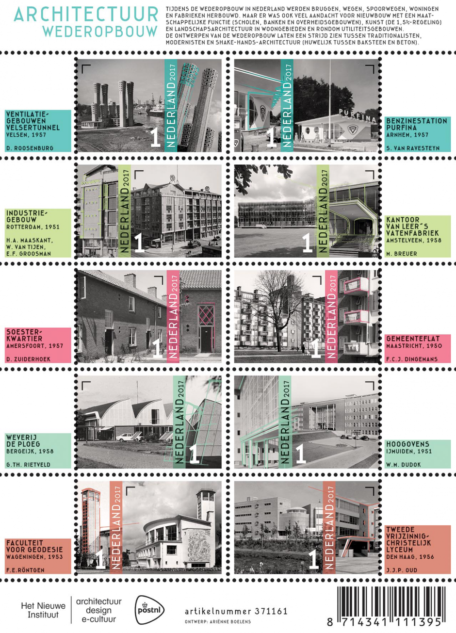
Architecture Reconstruction
Netherlands – On 11 September 2017, PostNL will issue a new stamp sheetlet with ten stamps dedicated to Dutch reconstruction architecture after the Second World War. The stamps feature black and white photos of ten buildings in different styles and with different functions, spread throughout the Netherlands. All of the buildings are post-war and date from the early reconstruction period (up till 1958). The ten buildings are the Velsertunnel ventilation building (Velsen, 1957), the Purfina petrol station (Arnhem, 1957), the Industriegebouw (Rotterdam, 1951), the office at Van Leer’s Vatenfabriek (drum factory) (Amstelveen, 1958), the Soesterkwartier residential district (Amersfoort, 1957), the Gemeenteflat (Maastricht, 1950), Weverij de Ploeg (De Ploeg Weaving Mill) (Bergeijk, 1958), the Hoogovens (steelworks) (IJmuiden, 1951), the Faculty of Geodesy (Wageningen, 1953) and the Tweede Vrijzinnig-Christelijk Lyceum (Second Liberal Christian Lyceum) (The Hague, 1954). The stamps are marked ‘Nederland 1’, the denomination for items up to 20g in weight destined for mail within the Netherlands. The stamps are designed by Ariënne Boelens from Rotterdam.
During the reconstruction period in the Netherlands after the Second World War, bridges, roads, railways, homes and factories were rebuilt. A great deal of attention was also paid to new buildings with a social function (schools, banks and government buildings), art (the 1.5% scheme) and landscaping in residential areas and around utility buildings. Since 2007, examples from this period have been designated national monuments, with a distinction being made between the early (1940-1958) and late (1959-1965) reconstruction period. Traditionalism dominated directly after the war in the restoration of farms, villages and city centres and expansion through the establishment of small new residential areas. Characteristic features include traditional designs, high, slanted tiled roofs, small overhangs and closed brick façades. In the major cities, more attention was paid to functionalism, with the form of the building following its function. Important features include flat roofs, white-plastered façades and an absence of decoration. Although both movements developed independently of each other after the War, the ‘handshake architecture’ (the union between brick and concrete) is proof that a combination of the two was also desired. Around 2.5 million buildings were constructed between 1940 and 1965.
The ten stamps in the Post-war architectural reconstruction stamp sheetlet feature photos of ten characteristic buildings from the early reconstruction period. There are two black and white photos of each building: an overview photo and a detailed photo. On each stamp, the two photos are separated from one another by a transparent vertical colour bar containing the typography. The postage value of 1 is right next to the bar. Thin coloured lines in the detail photo indicate the characteristic contours of the architecture. The tabs next to the stamps feature coloured boxes containing the name of the building, the place, the year construction was completed and the name of the architect. The same pastel tint is used for the vertical bar, the contour lines and the text box on the tab for each row of stamps. The name of the stamp sheetlet is printed on the top edge, along with a brief explanation of the character of the reconstruction architecture. The bottom edge provides space for the item number, barcode and the PostNL and Het Nieuwe Instituut logos. The photos on this stamp sheetlet mainly come from the archives of this architecture, design and digital culture museum in Rotterdam. The font used for the typography is DF-Camino, created by Dutch designer Ko Sliggers (DutchFonts, 2006).
The Post-war architectural reconstruction stamp sheetlet was designed by Ariënne Boelens from Rotterdam, which is recognised as the main reconstruction city in the Netherlands due to the German bombardment on 14 May 1940. ‘This assignment has given me a different perspective on the post-war new construction in Rotterdam,’ says Boelens. ‘Despite my interest in architecture, it was a construction period I didn’t know a lot about. Now I do.’
Het Nieuwe Instituut
Post-war reconstruction architecture was chosen as a subject in close consultation between Boelens, PostNL and Het Nieuwe Instituut. This Rotterdam museum possesses an enormous archive with information on Dutch architecture.
Guidelines
‘As a designer, I like to immerse myself in the content before putting pencil to paper,’ says Boelens. ‘I do that by reading a lot, exploring the archives and rummaging through the internet. I gradually devise guidelines for myself, within which I want to stay. I need this structure. The first thing I did was to limit the period. In my opinion, the first fifteen years after the War was crucial for the reconstruction. This was the time of decompartmentalisation, Drees with his social programme, space for art and greenery around buildings and in public spaces. Then I imposed a thematic limit on myself of five building types. The buildings are ranked on the stamp sheetlet. Infrastructure buildings are at the top, followed by houses, offices, factories, and finally, educational institutions.’
Visually strong
Boelens also wanted to highlight renowned architects. ‘Willem Dudok, of course, and Huig Maaskant, Jacobus Oud and Gerrit Rietveld. But also a less well-known one such as Sybold van Ravesteyn, the ‘baker’ among the architects, so much of whose work has unfortunately been demolished. The choice of the buildings themselves is based on visual impact and detailing. Look at the Velsertunnel’s beautiful ventilation towers. They look like flowers. I think they’re so beautiful. I put them on the first stamp immediately. Or the Van Leer office. The façades for that office are completely constructed from glass, which was extraordinary at that time. And the concrete details too, such as the entrance with the large overhanging canopy. There’s also the glass bridge in the Hoogovensegebouw, which is also extremely strong visually.’
Kill your darlings
Boelens ended up with a longlist of more than 20 buildings. ‘Way too many, of course. Then comes the stage in which you have to kill your darlings. I formulated new guidelines for this; for example that the building still had to be standing, and that there must be photos from the time of its construction. Therefore, by definition in black and white. I made the final choice with the invaluable help of Behrang Mousavi and Alfred Marks, Heritage Manager and Head of Collections, and Senior Archivist respectively at Het Nieuwe Instituut.
Understated
Only after making the final selection did Boelens start working on the design. ‘First I looked at whether I could blend several buildings with each other. It was an interesting concept materially speaking, but visually a complete failure. Then I developed a more understated solution, with two images of each building per stamp. The larger photo shows as much of the total building as possible, and the second zooms in on a characteristic detail. Sometimes that’s a contradiction within the same building. Look at how Oud connects the clean lines of the VCL buildings with a round tower.’
Character of the era
The original black and white photos were edited for use in the stamps. Boelens: ‘First of all I brought them back to pure black and white, and then I added a little yellow to prevent them from getting too cold. The typography and spot colours emphasise the character of the era. Each theme has its own pastel colour that reflects the understated hope of that period, but also the precision and neatness of that time. In retrospect this was also the reason that the first idea of having multiple buildings on a stamp was inadequate. This design would not suit the period. The two photos are connected with each other by the vertical colour bar, which also reflects the peace and freshness of that period. I’ve emphasised the details by using contour lines in the same colour. I can already picture a collector examining the detailing with a magnifying glass.’
About the designer:
Ariënne Boelens (1973) lives and works in Rotterdam from Ariënne Boelens office, an agency with a variable team of designers, including freelancers. Boelens trained in graphic design at the Willem de Kooning Academy in Rotterdam, graduating in 1996. From 1996 to 1999 she was cofounder and member of the designer collective, Flink. Since 1999 Boelens has been active as an independent designer in the cultural sector. In recent years she has expanded her field of work with assignments including the design of exhibitions, social design activities, and an advisory role in design and design for clients. Recent work includes assignments for bodies such as the municipality of Schiedam, Museum Rotterdam, Stichting Behoud Moderne Kunst (SBMK), the HotTug, the Rotterdam Salon and the National Education Museum.
Issue Date: 11.09.2017
Designer: Ariënne Boelens office
Printer: Joh. Enschedé Security Print, Haarlem
Process: Offset
Colours: cyan, magenta, yellow and black
Size: Stamp Size: 36 x 25mm, Sheet Size: 108 x 150mm